Visualising our good and bad intentions globally

I took part in an extremely inspiring meeting with Euan Semple and one of my clients in London recently. We talked about technology, communications and many other aspects of our work but also a personal approach to technology. At some point, our discussion drifted to the idea of visualisation of global efforts to drive change, improve our lives and strive for goodness as opposed to evil intentions. Do we remember those who are mean, evil, inhumane more often than inventors, scientists, artists or any other individual or cause which brings happiness to our lives? Can we visualise it?
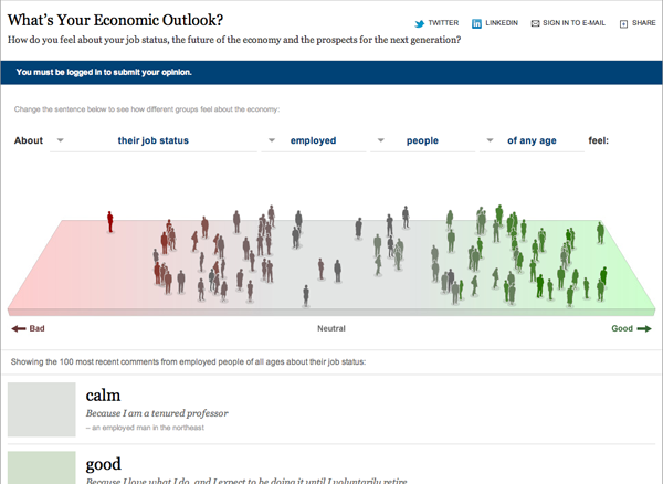
I am sure that today it is pretty impossible to measure human intentions. We had countless discussions with our IT team in my previous work place about monitoring of on-line conversations with specific focus on intentions (to purchase, to get involved, to act as brand ambassador or detractor) and I am sure that there are a lot of wise people out there digging into this area. On the other hand increasingly we see better and better attempts to visualise quite interesting sets of data. We have managed to visualise reactions to World Cup 2010 on Twitter or just in the UK reactions to elections. There is a great study of reactions to iPad launch on Twitter too! (worth checking out also for the points on noise analysis made there). There is a great visualisation of sentiments around economic outlook of the New York Times readers which I think is the closest to what we had in mind.
But can we really measure the real-time sentiment of all human beings living on this planet to see if good or evil is in the lead? Will we ever be able to do so? And if yes, would we want to know?


